by Caroline Leach | Jul 8, 2023 | Careers, Marketing & Analytics, Social Media

What happens when you post daily on LinkedIn? ✍️
A week ago, I decided to find out. I began a reprise of an experiment I did in 2017. At the time, I posted every weekday for a month, collected and analyzed data, and shared my findings in this article.
Back then, I was testing a hypothesis about how many posts are needed in a month to reach a certain percentage of my network.
Now, I’m doing a slightly different experiment. I’m posting daily, including weekends, during the month of July.
My hope is that this data will be valuable to you, too, as you think about your own content creation strategy.
I’ll share interim updates in July, and a full report in an article in August.
In this experiment, I want to answer these questions about content creation:
📊 What content is most engaging, or valuable, for serving my network?
📊 How can I increase the quality of my network through content creation?
📊 How will content creation enhance my personal brand?
It was a bit daunting to start this experiment during the 4th of July week. It feels like this week has evolved into what the week between Christmas and New Year’s Day is like. Everyone seems to be on vacation. This is great for quality of life, and not so great for interest in business content.
But I pressed on. Thanks in part to encouragement from various people.
And I’m happy I did. Here are some numbers for the past 7 days:
📈 Post impressions are up 862%
📈 Profile views are up 147%
📈 Search appearances are up 11%
Qualitatively, I’ve noticed other changes.
They all have to do with the ratio of salespeople (who I DON’T want to meet) to professionals (who I DO want to meet).
As a coach, consultant, and speaker, I hear from a LOT of salespeople who want to “fill my business pipeline and increase my revenue through done-for-me marketing.” No thank you. If it sounds too good to be true, it probably is.
What is changing in these first 7 days?
Profile views, connection requests, and DMs are all evolving. I’m seeing and hearing from much more interesting corporate professionals and business owners. These are exactly the people I’d like to get to know better and serve through my content.
My daughter thinks these changes are because the salespeople are on vacation this week, too. But time will tell as July unfolds. 😊
What questions do YOU want to see answered in this experiment?
by Caroline Leach | Feb 11, 2018 | Learning, Marketing & Analytics, Social Media

Coming up on nearly a year of posting a weekly LinkedIn article, what have I learned? What can you learn?
What articles are getting the most engagement?
Are there patterns among those top articles?
And how can this help you on your journey to build your career through social media?
It’s time to turn to another trusty spreadsheet, similar to my experiment on posting to LinkedIn every weekday for a month.
What’s in it?
- 35 articles, from May 2017 to January 2018
- Posting date and day of the week
- Engagement measures of clicks, likes, comments and shares
- Headline scores, characters, words, sentiment and type (thanks to CoSchedule, the content calendar company)
- Network reached, e.g., first- or second-degree network
After creating and populating my spreadsheet, I identified the best performing articles. What determined those? I looked at a general measure of engagement, a combination of the highest number of clicks to an article, along with likes, comments and shares. Then I sorted the data in a variety of ways and began looking for trends and patterns.
WHAT DIDN’T MATTER TO ENGAGEMENT?
A number of variables could be ruled out right away. They didn’t seem to matter to engagement.
Day of the week. About 70% of my articles were posted on a Wednesday, because I strive for consistency. What about the 30% posted on other weekdays? How did they do? The data says the day of the week doesn’t really matter. Articles on other days of the week didn’t do noticeably better or worse than others.
My conclusion? Continue the consistency with Wednesdays, experimenting with other days of the week on occasion.
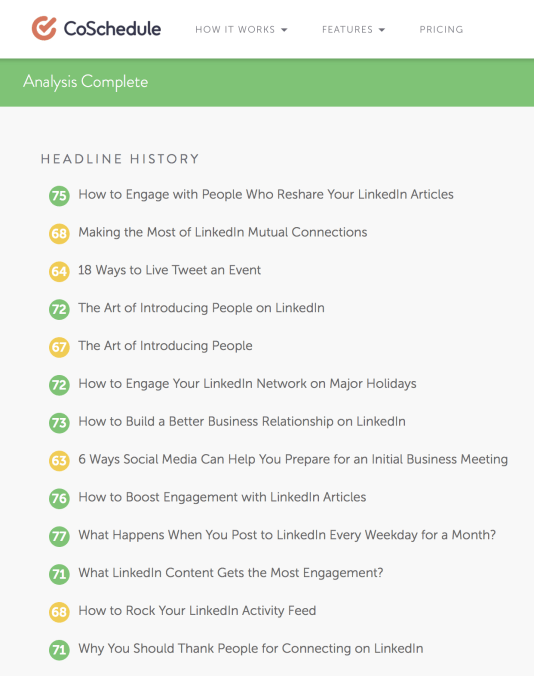
Headline score. Could better headlines attract more engagement? I experimented with headline analyzers from CoSchedule and the Advanced Marketing Institute and wrote about the experience in a few of my blog posts.
Looking at my top 10 LinkedIn articles, half had “strong” headline scores of 70+, about half had “average” scores between 55 and 69, and one had a “poor” score below 54.
My conclusion? While I believe there’s value in writing the most compelling headline possible, it’s not necessary to find or use the highest-scoring headline. I do believe using headline analyzers has improved the quality of my headlines over time, however, which has helped enhance my articles.
Headline sentiment. Would headlines with stronger sentiment, either positive or negative, perform better? The analysis of my own articles didn’t really bear that out. Of the top 10 headlines, 2 were positive and 8 were neutral.
My conclusion? It’s not necessary to focus on headline sentiment and making them more positive.
Headline type. In the top 10 articles, 4 headlines were generic, 2 were questions, 2 were lists, 1 was how to, and 1 was time based, using categories from CoSchedule. Again, no real pattern.
My conclusion? Variety and appropriateness to the particular topic are more important than finding a single most resonant type of headline.
WHAT WERE THE BIGGEST SURPRISES?
For each article I discovered I can click into a list of who has shared the article. What I can’t fully identify is whether this is a newly available feature, or if somehow I missed it before.
Previously, I was aware of shares if the sharer @mentioned me, or if it was included in a summary email from LinkedIn.
But clicking into these shares opened up a whole new perspective for me. With each new article I post, I’ll now check the shares daily. That way I can like and comment on those shares, along with any comments they’ve received. This may even highlight people I’d like to add to my LinkedIn network.
One of my articles, A Top 2018 PR Trend: Growth in Employee Advocacy, was shared by people beyond my network in Denmark, Italy and Mexico.

The shares in Denmark each had accompanying messages. But I don’t speak Danish. What to do? Enter Google Translate.

With this I had to take a leap of faith. I assumed the translation of “burn” had an alternate meaning of “promote” or “build.”
I discovered that 7 people in Denmark were promoting a workshop on employee advocacy and strategic branding through social media. It appeared that my article helped in underscoring the importance of employee advocacy programs.
So I keyed my own response into Google Translate from English to Danish and posted a reply to the first sharer, Gert Juhl. What fun to hear back a day later!
WHAT DID MATTER TO ENGAGEMENT?
To understand what really did matter to engagement, I identified my top performing articles, by a combination of clicks, likes, comments and shares.
Here they are:
1. What Happens When You Post to LinkedIn Every Day for a Month? (911 clicks, 75 likes, 17 comments, 22 shares, 77 strong headline score, neutral headline sentiment)

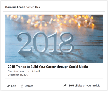
2. 2018 Trends to Build Your Career through Social Media (895 clicks, 49 likes, 5 comments, 80 shares, 66 average headline score, neutral headline sentiment)
3. 12 Ways to a Great LinkedIn Photo (500 clicks, 44 likes, 14 comments, 4 shares, 66 average headline score, positive headline sentiment)

4. How to Boost Engagement with LinkedIn Articles (301 clicks, 70 likes, 13 comments, 2 shares, 76 strong headline score, neutral headline sentiment)

5. Be Bold in Your LinkedIn Profile (292 clicks, 41 likes, 3 comments, 9 shares, 67 average headline score, positive headline sentiment)

My hypotheses as to why these articles got the highest engagement?
First, they answered important questions for people. What are the social media trends that could affect how to build a career? How to take a great LinkedIn photo? How to create a great profile? How to encourage engagement with articles? What happens by experimenting with daily content?
Second, they combined personal knowledge and experience and existing knowledge in unique ways. They shared my personal experiences (those that are non-confidential) with the intent of helping people in my network and beyond. They are unique, with my own perspective and insights. They are things only I could write. What are things only you could write about?
Third, it helps to have a post boosted by an employee advocacy program (note: opinions expressed in this article are my own.) The 2018 trends article was featured in my employer’s program, thanks to Nolan Carleton and Claire Mitzner. That’s the likely reason there were 80 shares, when shares for other articles were much lower. If your employee advocacy program has a feature where you can submit your articles for consideration, do it!
WHAT OTHER DATA WOULD HELP?
As I thought more about why certain articles performed better than others, I realized I need to add some new data fields to my spreadsheet for future analysis.
First, I’m now noting how people mentioned in an article relate to article engagement. I strive to mention and link to people in every article and @mention people in every post. That rounds out my perspective and boosts people in my network. When I promote articles, I mention them in LinkedIn and Twitter, and sometimes send them a DM, direct message, with a link to the article.
Second, I’m starting to measure the effectiveness of the LinkedIn posts and the tweets that promote the article. How much engagement are these getting? What can be learned from the highest-performing posts and tweets?
Because the functionality doesn’t seem to allow an @mention of people in the LinkedIn post that initially shares the article, I’ll start doing a separate LinkedIn post where I @mention people. Then I can compare how the two types of posts perform. Why is an @mention important? Because the person receives a notification that they were mentioned.
Third, I’ll note the impact (positive or negative change) in the week following the article being posted of my profile views, connection requests and new followers. This gives a sense of how my influence is changing as a result of publishing an article every week, along with the effectiveness of the particular article.
WHY IS DATA SO IMPORTANT?
After a recent week of observing bad behavior on LinkedIn, like new connections who immediately spammed me with a sales pitch, I decided I’d write a post about 10 things NOT to do in LinkedIn.
I jotted down my own pet peeves. Then I bounced them against a Google search of other similar articles. Not surprisingly, my list didn’t add anything new. So why write and post it?
That’s what prompted the realization it was time to return to my own data. What is it telling me about my weekly posting of articles? This is a unique and different story that only I can tell.
And that is what social media content creation is all about … sharing something new and different that can help your network … and that they aren’t going to find anywhere else.
There may be nothing new under the sun. But just as we each have unique fingerprints and unique DNA, we each have unique experiences in our careers. These are the powerful and valuable perspectives we can share with others.
by Caroline Leach | Sep 10, 2017 | Marketing & Analytics, Social Media

Headlines hold special power.
They determine whether people tap on a blog post or a LinkedIn article to read more, or whether they swipe past it.
“One of the best ways to make your content shareable, get found on search engines and grow your traffic is to write great headlines,” says Nathan Ellering of the marketing calendar company called Co-Schedule.
How do you create irresistible headlines?
“Write 25 different headlines for every post,” advises Garrett Moon, the co-founder of CoSchedule.
This echoes career blogger Penelope Trunk‘s mantra in her course on reaching your goals through blogging.
“Your title [or headline] is extremely important,” she says. “It should tell people what’s there beyond the click, and how it relates to your reader and how their life will change.”
Realizing that I devote hours to each blog post, but only spend a few minutes on a headline when I’m getting ready to publish, I knew it was time to switch the focus.
Quick Hacks to Help You Come Up with Attractive Blog Post Headlines by Marko Saric led me to CoSchedule’s headline analyzer.
Type in any headline. You’ll get instant data on word balance, headline type, length analysis, first 3 and last 3 words, keywords, and sentiment (positive, neutral or negative).
Plus, you’ll see how your headline will appear in a Google search or as an email subject line. Those first few words really matter.
Headlines are scored on a scale from 0 to 100. The best headlines (green) score at 70 and above. Average headlines (yellow) are 55 to 69, and bad headlines (red) are 54 and below.
This made me wonder how all of my blog headlines would stack up. So I did a little experiment. I entered all 152 of them into the headline analyzer.
And what a humbling experience it was. Only 36 headlines were green, 55 were yellow and 61 were red. Ouch!
What went wrong?
Two things stand out.
First, I was writing short headlines that would fit better into my current WordPress theme. I tried to be too clever and too brief so the headline would fit on a single line. As a result, the headlines weren’t fully describing what the post was about.
Second, I suffered from “the curse of knowledge.” This is a trick our brains play on us. When we’re highly familiar with certain information, we tend to assume that others are similarly informed, even though that logically makes no sense.
Because of this, I wasn’t assessing my headlines from the point of view of someone who didn’t know as much about the subject as I did. My brain filled in details, but since they weren’t in the headline, not enough information was there to interest a reader.
Yet there was a silver lining. In the last 9 months my headlines have been all green and yellow, with 50% in each category. Why? I wrote longer, more descriptive headlines. And this showed up in the analyzer scores.
Looking beyond the scores, I could see what headline types I was using. According to Ellering, the most effective types of headlines are list posts, how to’s, and questions.
The sentiment scores also attracted my attention. Headlines with neutral sentiment get the least engagement. Positive headlines attract the most attention. This is consistent with other data I’ve found on people being more inclined to share positive stores.
Then there’s the emotional angle to consider. The Advanced Marketing Institute developed an Emotional Marketing Value (EMV) score. This tells you how much of an emotional chord you’re striking with your readers.
As I wrote 25 headlines for this post, I tried the top-scoring ones in the Emotional Marketing Value Headline Analyzer.
Disappointingly, the top-scoring headline with a 76 – “Will the 25th Headline You Write be the Best?” – only rated a 22.22% EMV. That’s not great when a target of 30-40% EMV words is desirable, and higher is even better.
I chose this particular headline because I wanted to prove a point in this post. Writing 25 headlines helps get your creativity flowing, and you start writing better headlines once you get to 10 or 12. However, diminishing returns can set in. Rarely will the 25th headline be the best one.
But in the process you’ll come up with an optimal headline. While your 25th headline won’t likely be your best, there’s tremendous value in training your brain to write that many headlines.
Unfortunately my top headline didn’t hit enough emotional notes. So I went to the next-highest-scoring headline and made a few tweaks. I came up with “Do You Really Have to Write 25 Headlines to Get an Awesome One?”
This got an EMV score of 46.15%. That euphoric feeling only lasted until I entered it in the headline analyzer. Too many words, it said.
Is there a happy medium between the scientifically optimal headline and the emotionally appealing headline?
For this post, it turned out to be “Do You Have to Write 25 Headlines to Get an Awesome One?” Taking the “too wordy” feedback to heart, I eliminated the word “really.”
It was a balance between a 73 green score in the headline analyzer . . .

. . . and a 41.67% EMV score.

So what if the headline analyzer still said it was too wordy? Those words may just elicit more emotion – and more engagement with this post.
For now I’ll live with the cognitive dissonance of a headline analyzer that identifies 0% emotional words and an emotional marketing value analysis above 40%. Clearly the algorithms differ, so it’s something to explore in future posts.
And the most fun of all? The science of words is starting to turn me into a data geek after all.


Recent Comments